Muse among the Drafts: Part II
The ongoing aesthetic encounter
In a recent review of a work of contemporary video art, the novelist and poet Ben Lerner made a bizarre admission:
I’ve always thought of artworks as a kind of CAPTCHA test that I might not pass. Am I feeling the right things at the right pitch of intensity? What if I’m discovered to be lacking in some fundamental capacity—what if I’m the avatar or replicant? [reference to Blade Runner]
Are these the words of a neurotic adolescent or a highly successful writer, the recipient of MacArthur and Guggenheim fellowships and a Distinguished Professor, about whose works four-day academic conferences in Paris are held?
The gist of Lerner’s analogy is clear enough. He thinks of art, like those bot-filtering online prompts, as a challenge to his humanness. Besides this main point, Lerner’s choice of analogy and his rhetorical questions that follow imply all sorts of other things: that his feelings about an artwork fall somewhere along a continuum between very right and very wrong; that an authority, perhaps the artist or critics or scholarly consensus, exists to determine the “right” feelings; that somehow, since his own feelings are at risk of discovery, he is being surveilled when engaging an artwork. It’s all rather paranoid.
The condition of self-surveillance is endemic to our time; Lerner is admitting or feigning a personal orientation towards art likely shared by very many of his readers. (Prevalent today, too, is the figure of the artist as lifelong good student.) Those people among us who worry whether their feelings about a work of art are correct or not deserve our sympathies. An unfortunate way to live! Another implication of the test analogy, no less regrettable, is that aesthetic encounters are discrete—open and shut, fail or “pass.” All art lovers know this is false: The mark of a masterpiece is that it cannot be finished with. It haunts us. Our encounters with great art are never confined to a moment but ongoing, our responses—now active, now passive, through recollection and revisits—coming in waves. At times, we feel aesthetic revelation not with an initial encounter but when later finding a work in its nascent form, as an earlier version or draft. In the draft, we see what the Muse saw. And in what the draft lacks, we discover how the Muse inspired the artist.
Don’t wait for inspiration. It comes while one is working. —Henri Matisse, 1945 interview
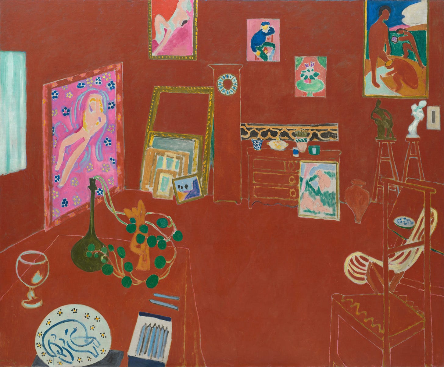
The Red Studio by Matisse is emphatically red—a red more meditative than emotive, not hot but warm. The pigment, Venetian red, was the shade most commonly used in Renaissance painting and is derived from iron oxide, or rust.
The best Rothkos have something like The Red Studio’s presence. (Also like Rothkos, all is lost in reproduction.) As with the great Abstract Expressionist works painted some forty-plus years later, The Red Studio has no stuck-in-time historical baggage about it. More than a century’s experiments on canvas between 1911 and now do not lessen its impact. Yet the painting is not a statement or an outburst or a corrective.1 It marries the figurative and the abstract without any aggression. What strikes you immediately is how weird it is. That weirdness becomes more exciting the longer you look.
How does one get to grips with this image? Curators Ann Temkin and Dorthe Aagesen describe how a viewer’s eyes swim about in the allover red:
The Red Studio invites a process of looking not tethered to any single target of attention or point of focus. The scene maps out the entirety of the canvas in a ringlike arrangement that suggests centrifugal force. This keeps the eye moving around the work’s surface. . . . The round ceramic plate in the foreground, with its wreath of flowers and curled-up nude, exemplifies this circularity.2
Two types of object are shown in the room, artworks (numerous paintings, the ceramic plate, sculptures in plaster, terracotta, bronze) and non-artworks (two tables, a grandfather clock, drawers, stools, two chairs, a wine glass, other knickknacks). While the artist’s works are identifiable and maintain their pictorial integrity, the pieces of furniture are subsumed by the red, only their edges remaining.
Edges, not outlines. One aspect of The Red Studio that is so compelling, which draws the viewer in, is the spectral quality of these uneven edge-lines.3 Had Matisse painted a truly allover red background and then traced over it the furniture’s outlines in long strokes of a thin, painted-charged brush, the result would be an entirely different painting. Instead, without having to get especially close, a viewer can see how the Venetian red has seeped around and within what were pre-existing forms and stopped when it reached their edges. The remnants of a painted layer beneath the allover surface give the composition an idea of depth that the visual mass of Venetian red totally rejects. The contradiction is exhilarating.
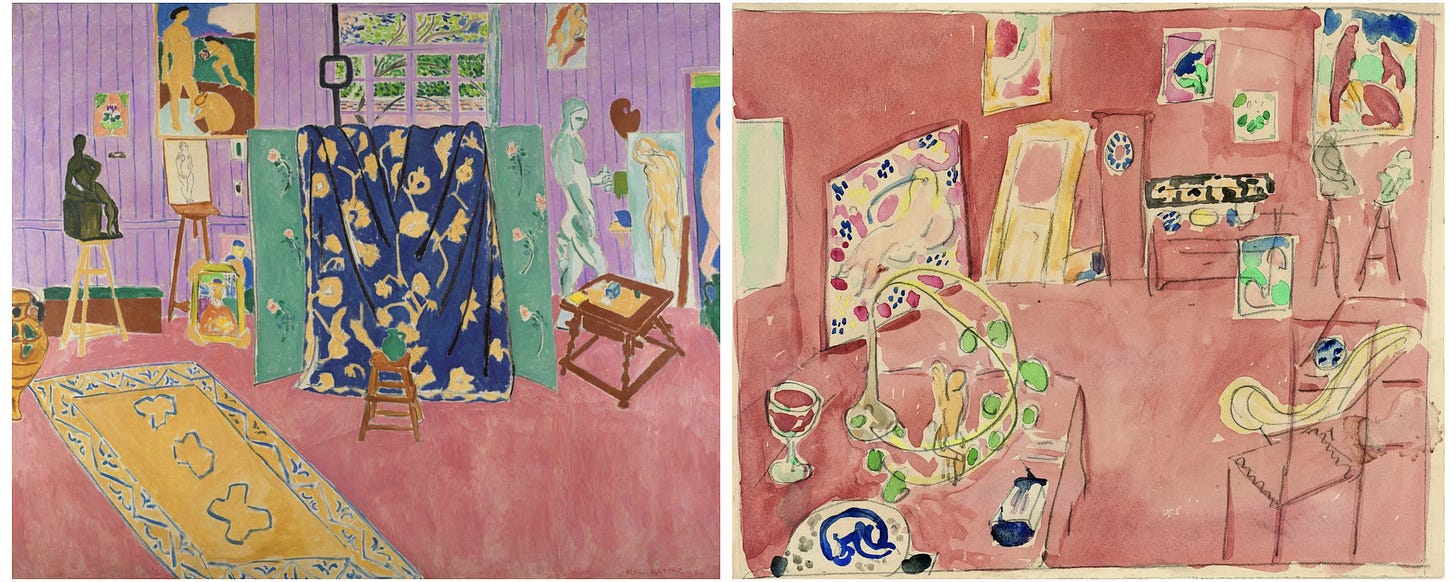
Seeing The Red Studio for the first time, you might perceive and feel all of this. If the painting affects you enough, instinctively you will go on to consider it alongside other works by Matisse. Two in particular, by comparison, might heighten your sense of The Red Studio’s arresting qualities. The Pink Studio (above left), a more realistic depiction of the same room, was painted earlier that year. His watercolour study after The Red Studio (above right), made at the prospective buyer’s request, is charming and has none of the extremity of the original. In contrast with the translucent watercolour pigment, the Venetian red oil appears even more matte, and flat, and hummingly dense.
We now know The Red Studio had been, in a word, conventional. Like The Pink Studio, its furniture and floor and walls were originally painted distinct colours—ochre and pink and blue with green vertical lines, respectively. (This was already a nonnatural depiction. Historical records show Matisse’s Issy-les-Moulineaux workspace had a wood floor and paneled walls painted white.) Art historians had long suspected the interior scene was differently coloured at an earlier stage. Recent analysis by MoMA conservators has shown how the painting was initially conceived, and executed, by the artist.4
The conservators not only found The Red Studio’s original colour scheme. They also proved that before Matisse painted over more than two-thirds of the canvas with Venetian red—which he did in fast and decisive strokes, losing brush bristles as he went—the painting’s underlayer had fully dried. For a month or more, he had left the painting alone. And one day, in a single session, he covered the foreground and background almost entirely in red.
Around that time, Matisse told an interviewer visiting his studio that the painting “hasn’t become the way I originally envisioned it. I like it, but I don’t completely understand it. I don’t know why I painted it precisely this way.”
He doesn’t know because he didn’t paint it: The Muse did, through him. The Red Studio is electrifying on first encounter. Knowing Matisse introduced the red in a delayed yet sudden act, outside his own volition, makes the painting, seen again, all the more electrifying.
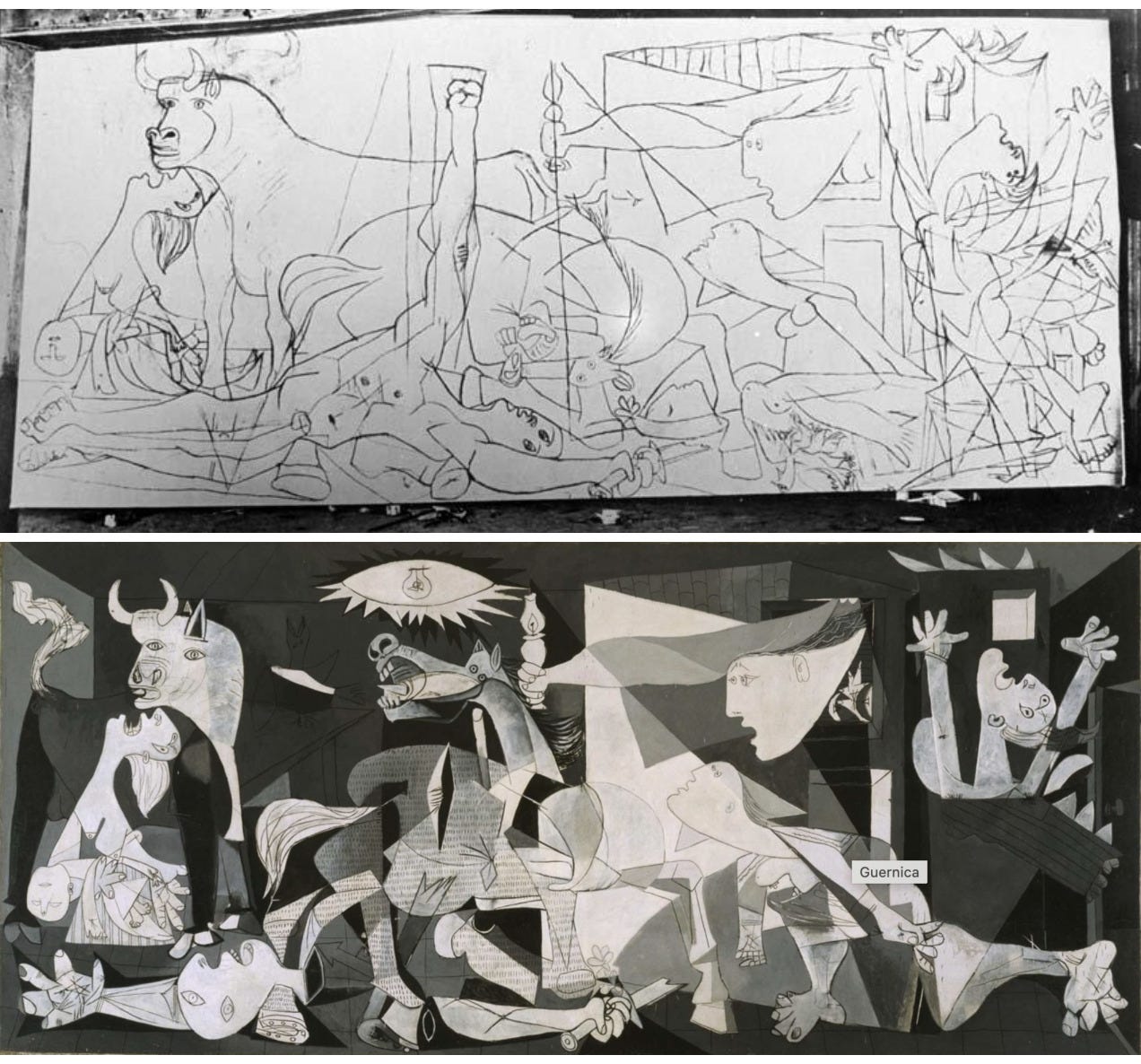
The story of how Picasso came to create Guernica is legendary, it does not need repeating. Anyone who has read up on its history or visited the Reina Sofia knows of Dora Maar’s photographs documenting his process. In 28 black-and-white shots taken at the artist’s studio, Maar captured how Guernica’s composition morphed over four of the five weeks it took him to complete the mural-sized painting.
Directly on the canvas, Picasso reworked Guernica’s form and content over multiple stages—adding and removing figures, altering their poses, adjusting the placement and density of forms, bringing clarity and chaos into greater tension.5 Seeing in Maar’s photographs how the artist laboured to produce his final composition only makes us marvel anew at the awful perfection of the completed work. However, to grasp why a particular image in the painting is so searing, and to feel most fully the pathos of that image, an art lover might turn to Picasso’s earlier sketches for Guernica on paper.
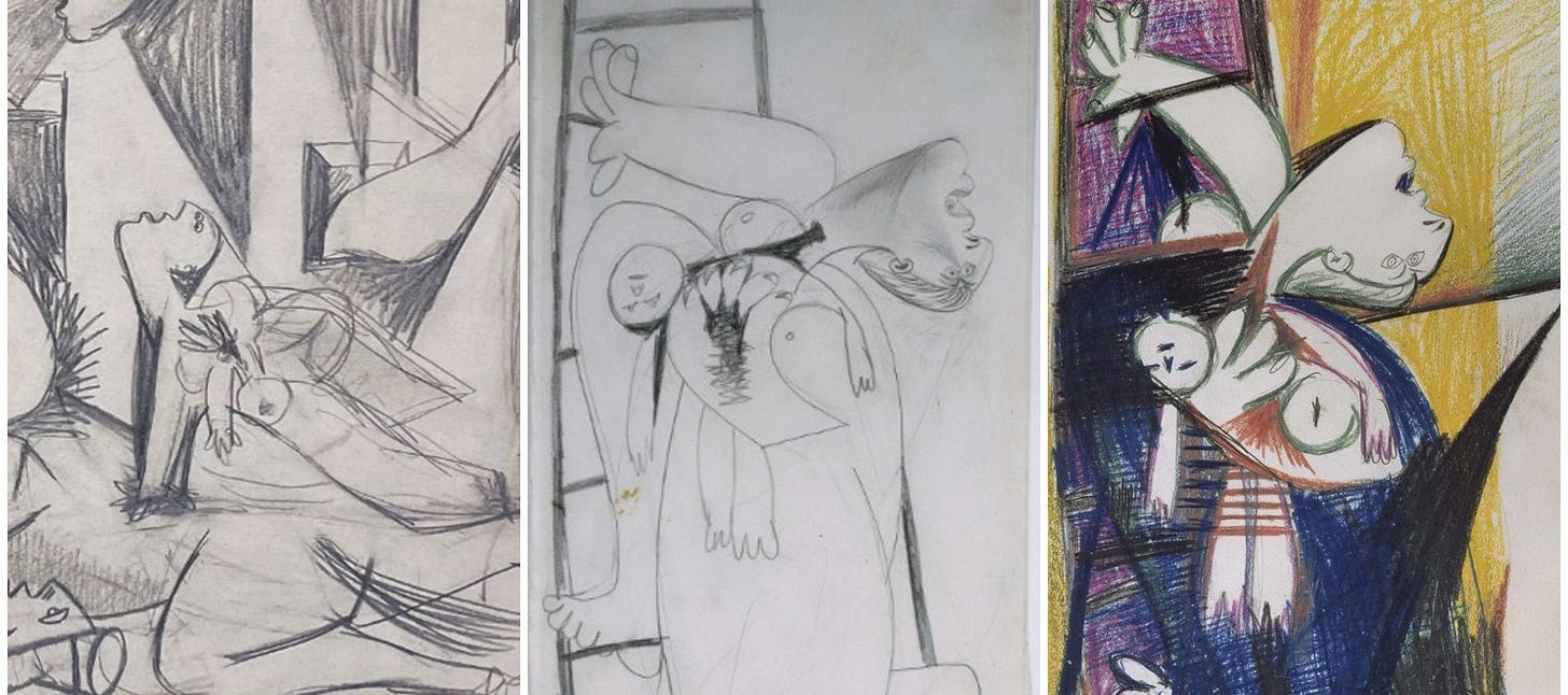
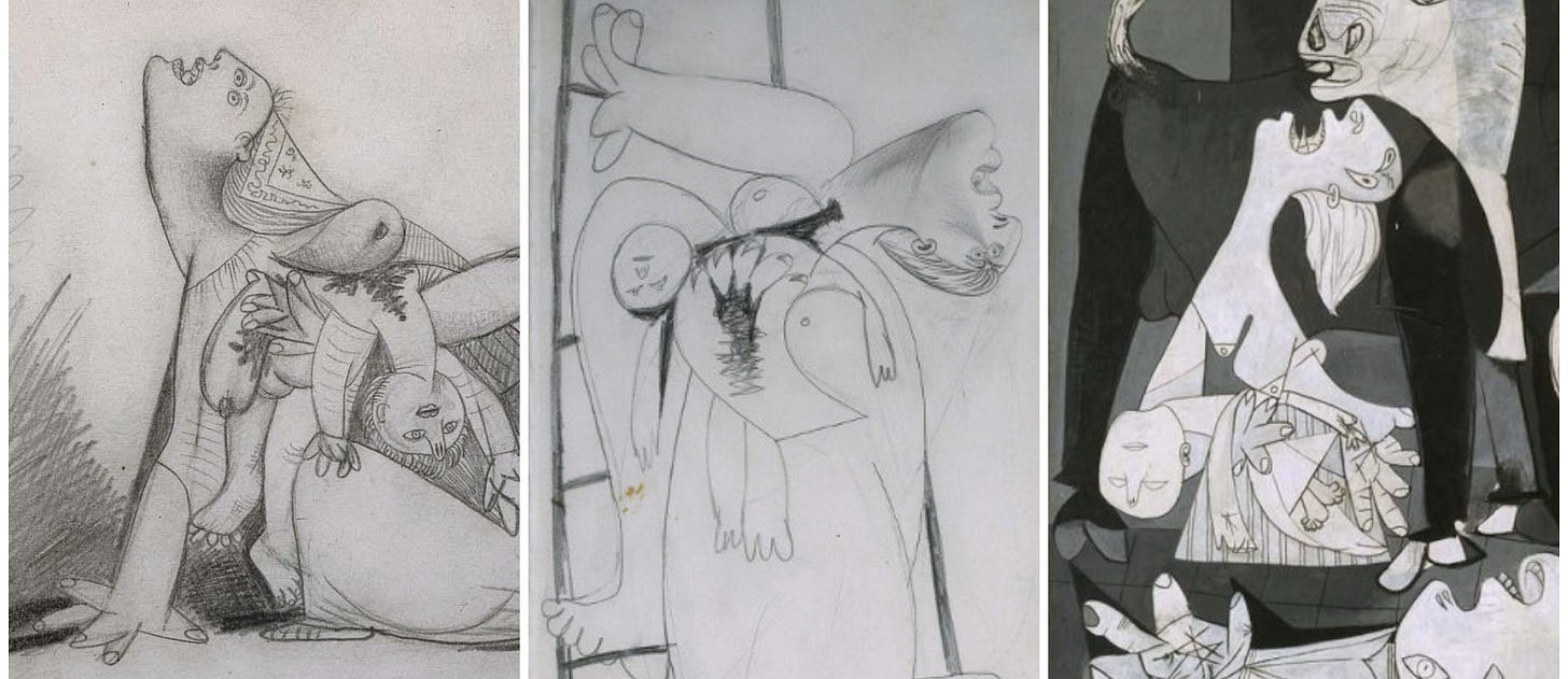
He began sketching on May 1, 1937. In two drawings made on May 8 and one on May 9 (above, from left), the artist sketches in increasing detail the figure of a woman on her hands and knees, holding a dead child and wailing to the sky. A full composition study that he drafts on May 9 (below left) has in it the same mother and child. Also on May 9, and then on May 10 (below center and right), he draws the same figure again but now on a ladder, so that the woman’s pose is rotated ninety-degrees clockwise. The infant’s body hangs in the opposite direction and the mother’s head tips fully back. All the drawings are disturbing.
Dora Maar’s first photograph of the Guernica canvas is taken on May 11 and shows Picasso’s initial completed design (below). A lot would change; few elements remain unaltered in the final painting. At the canvas’s far left on May 11 is the painted outline of a wailing mother holding in one arm the limp body of her dead child. This image is basically what it will be in Guernica.
But it is not the figure of mother and child transposed from one of the drawings. On canvas, the dead infant falls with his head to the left, the wailing woman kneels, her free hand gestures emptily to the right, and she throws back her head in a scream so that her gaping mouth points to the sky and, crucially, her hair falls straight down. The pose takes aspects from the artist’s sketches but is not a copy of them. Comparing the painted woman to the women in the drawings, we see why her scream is the most piercing. She doesn’t try to move, to go anywhere. The fully exposed neck leading to her bared breasts, which will never again nurse her child; the more agonized, unnatural angle of her head; the empty hand; the limp, hanging hair: It is an image of total pain and total helplessness, beyond desperation. How Picasso went from the May 8–10 drawings to the May 11 painted outline is a marvel. The Muse must have interceded.
What art communicates is never divorced from how it does so. And the how—an artwork’s aesthetics—is always and in the first place what impresses upon our spirit and our senses. In a draft or earlier version, we often find much the same content as in the completed work, but its authority lacking, its impression on us—and thereby its meaning—muted.
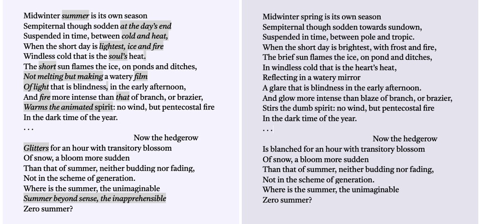
Conversely, our appreciation of an artwork can be hindered by its overt meaning. The late, great Marjorie Perloff, in her last book of literary criticism, Infrathin: An Experiment in Micropoetics (2021), offers a remarkable close reading of T. S. Eliot’s “Little Gidding,” from his own final poetry volume, Four Quartets (1943). A lover of Eliot’s early poems, Perloff previously found the Quartets “too contrived in their exposition of Christian doctrine.” Through comparing a manuscript draft of the opening verse from “Little Gidding” to the published poem, detecting in the latter how “every phoneme, every morpheme, word, phrase, rhythm, and syntactic contour has been chosen with an eye to creating a brilliant verbal, visual, and sound structure,” she locates in its aesthetics the poem’s enduring power. Though he barely changes the passage’s semantic meaning, Eliot so modifies its “aural effects” as to elevate the poem to a state of “distinction and authority.”6 His amendments bring the Muse’s music to our ears.
This approach to poetry is entirely concerned with aesthetic sensitivity. In her introduction, Perloff all-too-patiently dismisses the conflation of her “micropoetics” close reading with the outdated methods of New Criticism.7 Why the New Critics are still invoked—why that half-century-dead horse continues to be flogged—in order to write off lovers of art is no mystery. Only those half-numb can be so knowing. For reasons of their own insecurities, many simply cannot countenance art’s autonomy. The rest of us, with the days we’re given, seek out traces of the Muse.
This is the second installment of a two-part essay. Read “Muse among the Drafts: Part I,” about Sandro Botticelli’s Saint Sebastian, here.
Paid subscriptions are now optional. Support me and I might write more, more often.
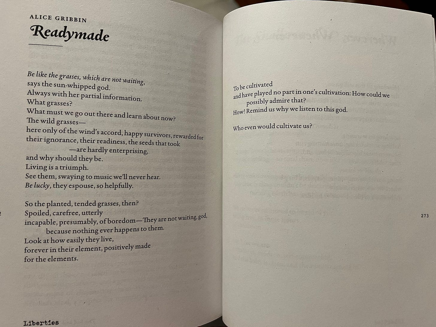
P.S., Look out for the new issue of Liberties (amazingly orange cover), in which I have five poems. Me right before Vendler on Whitman, ha! Here is one:
Although typically there are fine works on view in the Surrealism gallery on the fifth floor of the Museum of Modern Art in New York, all the art suffers terribly for being in a room adjoining the Matisse gallery. When The Red Studio is on display, everything in the vicinity risks appearing overwrought, juvenile, dogmatic, or lame in comparison.
The quote comes from the catalogue of a 2022 MoMA exhibition that reunited The Red Studio with Matisse’s artworks depicted in the painting. The catalogue is marvelous.
Frank Stella’s Black Paintings from the late fifties, a series of four geometric works, are composed of wide painted bands with thin lines (or “pinstripe” edge-lines) of raw canvas left between them, with a similar effect. In his early photo series The Secret World of Frank Stella, Hollis Frampton captures Stella at work on one of these austere paintings.
To those interested, I highly recommend this YouTube video of the MoMA conservators explaining their findings.
For example, moving through the stills we see how the great raised fist at the canvas’s center-left, one of the less subtle of all political symbols, later became a hand grasping stalks of wheat, still somewhat frank, and then was scrapped altogether.
Why, Perloff asks, is this passage so uniquely memorable? Not because of its syntax or imagery: The syntax is “largely straight-forward,” the imagery “unabashedly out of the English poetic tradition” (Donne, Herrick, Shelley). Its memorability, her analysis demonstrates, is a function of its sound.
For the New Critics, metaphor is “at the very heart of poetry”; all structure is “semantic structure.” They have little or nothing to say about a poem’s “rhythm, sound structure, visual patterning, etymology,” nor the use of “literal language, metonymy, and visual design”—with the result that poets from Shelley to Williams, Milton to Pound, are simply ignored. Perloff dispatches, too, with the suggestion that closing reading need neglect an artwork’s “historical frame or context.” Later she makes the case for Eliot as a forerunner of Concrete poetry. She does, on the other hand, credit certain Russian Formalist approaches.




This writing is on fire. Grateful to have discovered this ‘stack and will be going back through the archives…
This is great. Thank you and congratulations on the poetry publication.
Perloff's death this year is a great loss. Your notes on her book remind me of Sir Christopher Ricks' lecture about Eliot's 'auditory imagination': https://www.youtube.com/watch?v=zhkcrQ09YdU&t=3s